
By Adam Bierstedt
When March 2020 rolled around, a lot of museums panicked. Visitors make up an enormous amount of museum revenue, and suddenly due a teeny tiny plague outbreak, nobody was able to visit a museum! Loads of events were immediately cancelled, exhibitions that were being planned years in advance had to be put on hold, it just wasn’t fun.
With everything moving online, museums often were left scrambling to make their physical exhibitions available virtually. There was some… mixed results, to say the least. But, three years on, I think we’re finally able to take a look back and see how people “solved” the problem of the pandemic, and take some lessons for how to make things work online!
Under the big umbrella of “Virtual Exhibitions,” I think we can make two big camps – physical exhibitions that are replicated online and exhibitions that were intended to be online in the first place. I’ll be honest, I think the second one generally works much better, but there’s brilliant work done in both.
virtual exhibitions take almost exactly as much time and effort as physical ones do (at least, they do if you want them to be any good).
There’s also really questionable work done by both.
Even the most questionable work has things to learn, though, so we’re going to dig in just a little bit. I want to start by outlining what (in my opinion) are the competing concerns behind a virtual exhibition, then showing how each of the two big types of exhibit solve for virtual tours.
This was, by the way, a stream that happened recently over on Twitch as well, so do stop by live!
Why is this hard
Making exhibitions is a lot of work. However much you’re thinking, it’s more than that. A small exhibit in one glass case might take 3 or 4 months to create. A big one across 5 or 6 rooms? 3-5 years, minimum.
Being online would seem to solve those problems, though! You don’t have to build mounts for the objects, ship loans from overseas, worry about damage to artifacts, create labels, arrange everything in the case, and make sure everything’s nice and dusted for the grand opening. And with how (relatively) easy it is to create webpages and other programs, that should make it low-cost, quick, and simple!
Or… not.
In truth, virtual exhibitions take almost exactly as much time and effort as physical ones do (at least, they do if you want them to be any good). While we don’t need to go through a whole curatorial pipeline here, it does make sense to outline some of the concerns museum staff are balancing
- Objects – what’s being chosen? Videos and drawings perhaps work digitally better than sculpture! If you are trying to do a virtual exhibition with sculpture, vehicles, books, or textiles, that’ll shape what software and design you use! Objects may need to be digitized for the exhibition, or if it’s a video the museum has on VHS, reformatted for modern file types.
- Resolution – We don’t want to run out of pixels for the objects in our care! That means making sure that digital images, especially of objects that involve text, are high-enough resolution to be read clearly!
- Accessibility – Part of every public museum’s job is to make sure that the public is able to view the objects the museum holds! What that mean can vary, but ideally that means everyone is able to see these exhibits. That includes blind/low-vision and deaf people, people without high-end machines, grandparents with minimal tech literacy, families, people who only have a phone, people with satellite Wi-Fi, etc. etc. How do you make a very high-res image render on a 3 Mbps connection?
- Navigation – How do you lay things out on the exhibition page? How many clicks does it take to see everything? Do they have a UX designer and QA testers? If they follow a link and hit “back,” will it save their position on the web page?
- Interpretation – As with a physical exhibit, curators have a really limited amount of space. In-person, visitors typically take about 6 seconds or 100 words to get bored. You can get away with a little more online, but it’s like… 150 works, not 1000.
- Price – this is an obvious one, but exhibitions have budgets! If a software license is paid (or expensive), that will affect what designs are possible!
- Longevity – Is this exhibit meant to be accessible for a few months? A few years? Forever? How do you protect against link rot, server shutdowns, etc. for each of those?
That’s a lot! And it’s basically impossible to make everyone happy. High-resolution files are inaccessible on phones and slow connections, mobile-friendly design messes with layouts that look good on desktop, you have to write alt-text descriptions which increases labor costs, adding embedded videos and images that you aren’t directly hosting is risky….. the list goes on and on.
As we’ll see, different places have balanced these in different ways, and so even though many exhibits don’t work very well, I think there’s a lot to appreciate with the creativity that goes into them.
Digitizing a Physical Exhibit
Okay, let’s get into some specifics now. One of the most common strategies for turning a physical exhibition digital is to simply scan the whole thing. There are some tools like Matterport that allow institutions to create a “digital twin” of a physical space relatively easily, and institutions ranging from the State Historical Society of Iowa to Abu Simbel Temple have used the software to digitize their physical space.
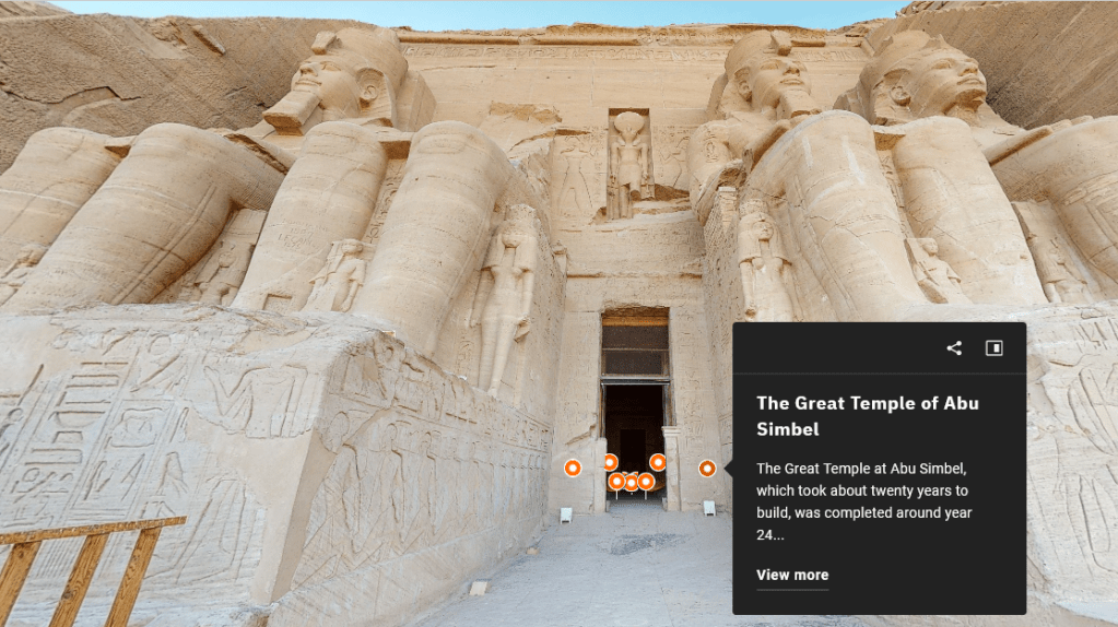
Abu Simbel in Matterport. Okay, that’s pretty cool.
To help out, Matterport has various color-coded dots that will pull up a text label. Institutions can choose in the “view more” button to link to a higher-resolution image, provide information like audio tours that can’t be included on a physical label, and more.
It’s a really cool concept, and one that can work really well! I want to particularly highlight the exhibition Toi Tū Toi Ora, put on and digitized by the Auckland Art Gallery in Aotearoa/NZ. From what I heard, it’s a magnificent physical exhibit, and they digitized it really well. They used a custom tool, not Matterport, but the core premise is the same.
One of my big problems with these digitized exhibits, though, is an issue of resolution. Museums thrive on detail – small text labels, delicate brushstrokes, masterful sculptural details. Digitizing that successfully requires really, really high-resolution imaging. Generally speaking, rendering platform holders aren’t willing to host that much data!
This problem can be seen really clearly with the British Museum. They partnered with Google Street View to allow people to “walk around” a pretty significant chunk of the museum, which is really impressive! But, if you try and read any of the labels, you’re doomed to frustration – the JPEG compression renders the vast majority of the text unreadable, and very few objects have any sort of digital label. This is a real accessibility issue, but even if you don’t need/prefer to use a screen reader, it’s frustrating!
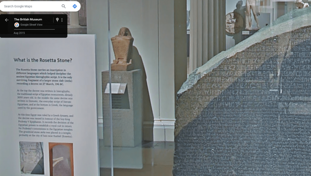
The Rosetta Stone, Google Street View. You can almost count the pixels on that text block
Matterport digitizations have the same issue – the “True to Nature” exhibit digitized by the National Gallery of Art is, in my opinion, a pretty poor viewing experience for some of my favorite artworks of all time! The NGA did a great job making sure all the labels were transcribed, but they don’t link to catalog images of all the works in the exhibition! If you’re viewing on a fairly small device then (tablet, phone, or chromebook), the most detail you can get is however far the software lets you zoom in. It’s acceptable, but I’m not moved by the virtual version of Achille Etna Michallon’s The Oak and the Reed in the way that I was when I saw the actual piece at the Fitzwilliam Museum.
I think that’s what makes Toi Tū Toi Ora so special – where most digitized exhibits lose so much information that it becomes a physical exhibit but worse, they did several smart things to improve it. The sound design, color, UI, image quality, and tours they added to the virtual tour to communicate a really specific experience makes it just incredible.
Ultimately, though, I think the deciding factor between a successful digitized exhibit and an unsuccessful one is… how good of a physical exhibit it was. It takes a ton of work to make a digital version of an exhibition even equal to the physical one, so a cluttered story of Stuff on Walls isn’t going to suddenly become a brilliant exhibit when rendered via a Street View camera.
Exhibits on the Web
The other main category of Virtual Exhibits I see are those that were built from the beginning to be digital. In short, they’re a webpage – a dressed-up webpage, usually, but at their core just a webpage. This can result in a lot of low production value exhibits, but also a lot of cool stuff.
Google Arts and Culture is the fancy name in town here – while their “explore a museum” is just the Street View concept I don’t like, the story scrolls are a remarkable bit of web design. It lets museums assemble exhibits with labels, artworks, and sound clips to create a highly curated single experience. Audiences really can’t jump around, they just… doomscroll. But with art.
It’s better than the Site Formerly Known as Twitter.
There’s a lot more in Arts and Culture that I haven’t played with enough to talk about, but there is a lot to like here. But, tbh, it’s over-designed for me. The Metropolitan Museum of Art’s 150th anniversary virtual tour is illustrative (while there was a physical exhibit, this version is designed from the ground up to be virtual). It auto-plays video clips, it has some pretty serious contrast issues, and the information I care about most – what the name of the piece is – is hidden in a pop-up in the corner!
white text on a light grey background hurts my eyes
Navigation is also a serious issue – the Smithsonian’s exhibition A Dark, A Light, A Bright: The Designs of Dorothy Liebes does not intuitively link page to page. The first image says “Learn How Liebes Got Her Start as a California Handweaver” but it takes a minimum of 3 clicks and a scroll to actually get to Susan Brown’s essay on the topic! (The fact that it’s an 8-paragraph biography is also an issue, but it’s important info, so I don’t mind). The site simply provides too many ways to move through the exhibition, and so catalog essays, introductory videos, and other information that contextualizes the images and video footage on display get buried in the pile of decisions.
Good labels and good images are the most important things
All that is to say: Simplicity is good! There’s a reason Smithsonian Magazine listed the National Portrait Gallery’s First Ladies of the United States as the best virtual exhibit of 2020 – it really centers the content.
Design-wise, there’s really nothing remarkable here: it’s a basic tile design with a hover-text on each portrait that says which First Lady the portrait is of. The contextual labels are above each set of tiles in plain black text, and the biographies appear only when you click on a portrait.
But, it does a few really great things:
- The portrait is catalog-quality, so you can zoom in really far to examine details without compression, and download the image directly.
- The biography links to any other portraits of that First Lady that the National Portrait Gallery owns
- It has an “Educational Resources” tab that has a really robust bibliography, prioritizing online resources.
- It has a “Research” tab with the collections search, social media, podcasts, and more to go beyond the exhibit itself.
I like that a lot, and in my conversations with other exhibition designers, they think that’s the best way to do it to. Good labels and good images are the most important things – a born-digital exhibit’s design should supplement those, not obscure or distract from them!
Takeaways
I don’t think there is a “correct” way to do a virtual exhibit – TTTO would be terrible as a webpage. But, my anecdotal experience is that people tend to like the average born-digital exhibit more than the average digitized exhibit.
The best explanation I’ve been able to come up with for that is that ease-of-use is everything. It’s well-known in the museum world that audiences will stand to read a label for approximately 10 seconds, but much less attention is paid to clicks. While the “Three-Click Rule” of online navigation isn’t actually true, a polished UI and clear sitemap are still incredibly important! Without it, users get bored, and can always click away. Unfortunately, Matterport has a pretty cluttered UI, and its upsides don’t compensate for that.
I think there is a second part to it, though. Digitizing a real exhibit misses.. a lot. Scholars like Ray Ballantyne have spent a lot of time thinking about how museums are fundamentally social – people learn better when they experience museums with other people! The background noise of people talking to each other, pointing out details to others, the faint smell of old paper and paint, all of those intangibles actually make a significant difference! And a digitized space can’t replicate that.
Born-digital exhibits sidestep the problem entirely, though. Since they structurally mirror webpages, not physical spaces, it’s more palatable, on average, to have a solo experience. They also ensure that text is screen-readable and do other good accessibility things! And, lastly, unless you have a good physical exhibit, they’re way easier to create! I bet it’s possible (and fairly straightforward) to build a site here on WordPress that serves as an exhibition. It won’t win any design awards, but may be good enough for an independent project or small institution.
I love virtual exhibitions, and its a shame that so many museums are turning away from them now that they’re not required to because of lockdowns. Good virtual exhibits generate goodwill for the museum and can integrate with physical displays or stores to still allow the exhibit to earn revenue. Prioritize accessibility and high-quality content, not flashy designs and software, and I think there’s a lot of upside still to be explored.
post-script: Virtual exhibits 2.0
There is one really innovative project I want to talk about that didn’t really fit into the rest of the blog. The Rijksmuseum in the Netherlands runs a platform called Rijksstudio, and it’s the coolest.
Basically, instead of investing resources into building an exhibition using all the criteria I talked about, they invested it into a platform that allows users to browse the catalog, edit or clip catalog images, and publish their own collection on the Rijksmuseum’s website!
Design-wise, it’s actually nothing to write home about. It’s basically ripping off Pinterest. But, yknow, ripping off the incredibly successful social media/image conglomeration site is pretty smart for you own social image conglomeration site, so no harm, no foul.
What makes it incredible is that it is the culmination of literally decades of work by digitizers and catalogers. The Rijksmuseum has made about eight hundred thousand pieces of art available, in digital surrogate, for audiences to play with. There are robust search tags for every object, direct links from every Rijksstudio to the museum collections search to learn more, and editing tools that work seamlessly with the file formats the digitization team chose to focus on.
What I love about it is that it allows viewers to identify and explore connections between objects that no curator would either think of or be able to assemble an exhibit around. Like hats. or pets. Okay, actually, I bet a curator could probably get funding to do an exhibit on pets, but that doesn’t make it less cool that the visitors are the ones with the power!
Much has been made of “Web 2.0” style content in cultural heritage institutions (and more than a few stupid buy-ins to NFTs as “Web 3.0”), but what that really means is a pretty boring approach to social media accounts. Rijksstudio suggests a way for virtual exhibits to be “user-generated” in a way that makes the museum more successful at its goals of inclusion and relevancy, without using up curatorial resources that are used for tradition, extremely high-budget exhibitions.
It only takes 30+ years of investment into digitization infrastructure to do it. Easy.
Ludohistory is made possible only through viewer support. If you enjoyed this post and want to support the channel, please do consider joining on Patreon.

Leave a comment